How to Choose Wall Art Colours: Expert Tips for Every Room
Short Answer
👉 Choose wall art colors by considering your furniture, wall paint, lighting, and the mood you want to create.
Whether you’re asking:
-
How to pick wall art colors for a living room
-
What colors work above a bed or sofa
-
How to match prints with existing furniture
This guide gives expert, actionable rules with color swatches, room examples, and tips for modern interiors.
Step 1: Consider Your Room’s Base Colors
-
Walls: Neutral walls → bolder prints work well
-
Furniture: Match or contrast prints to sofa, chairs, or headboard
-
Flooring / Rugs: Consider tones in rugs or wooden flooring
Tip: Use the 60-30-10 rule: 60% dominant color (walls/furniture), 30% secondary (furniture/prints), 10% accent (artwork).

Step 2: Think About Mood & Psychology
-
Calm & serene: blues, greens, muted tones
-
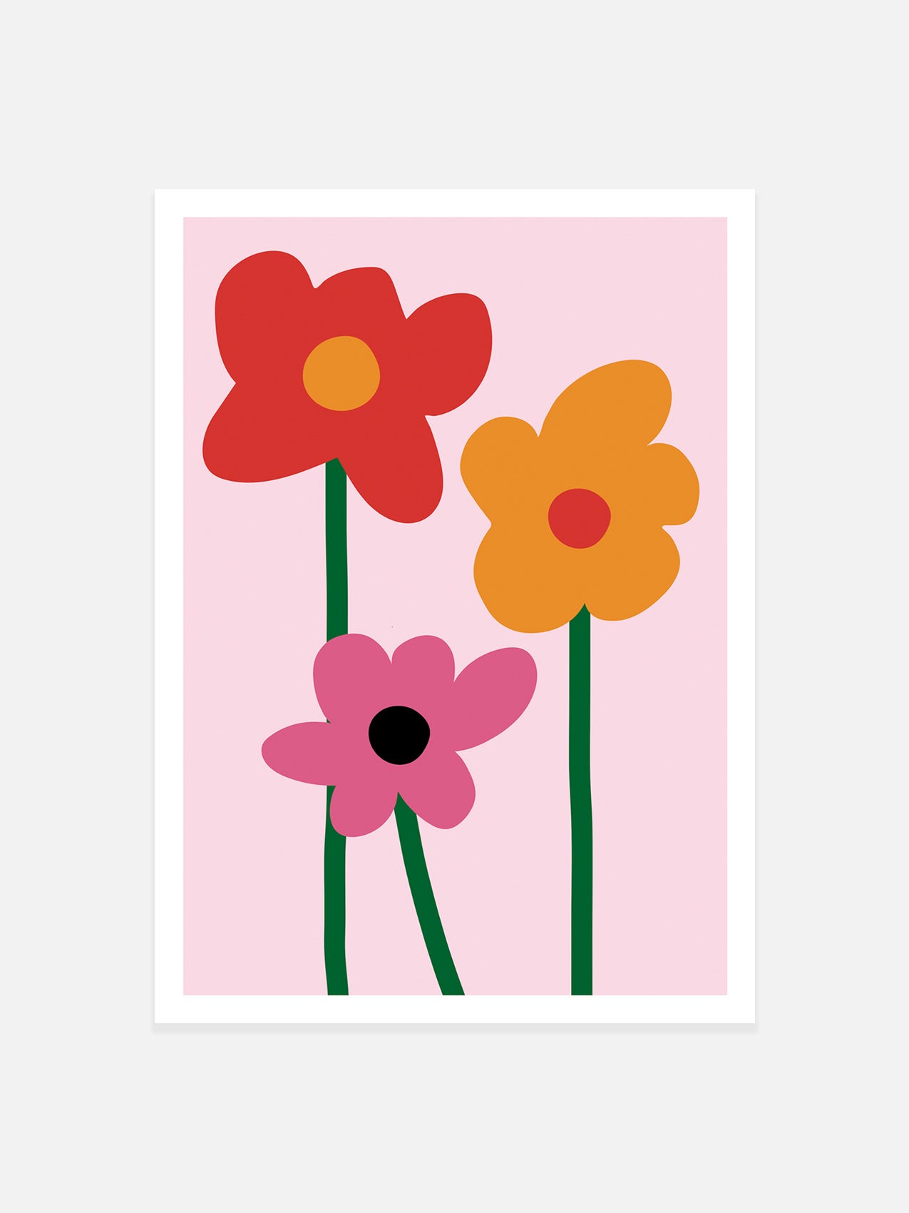
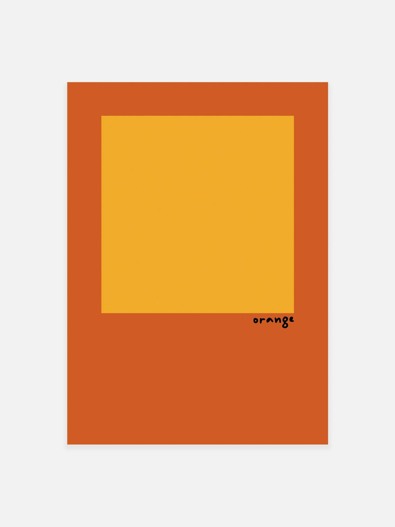
Energy & creativity: yellows, oranges, reds
-
Luxury & elegance: deep jewel tones, gold accents
-
Minimalist / modern: monochrome, black/white prints
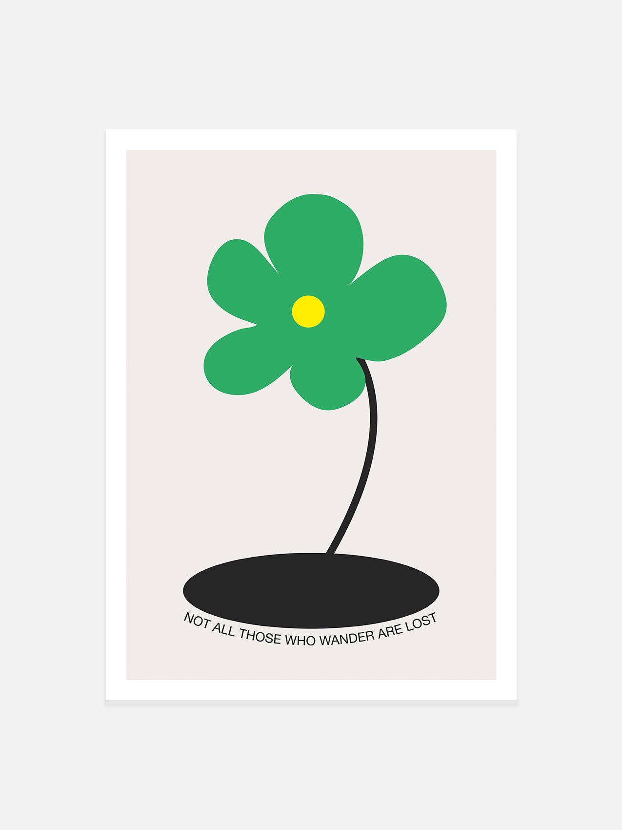
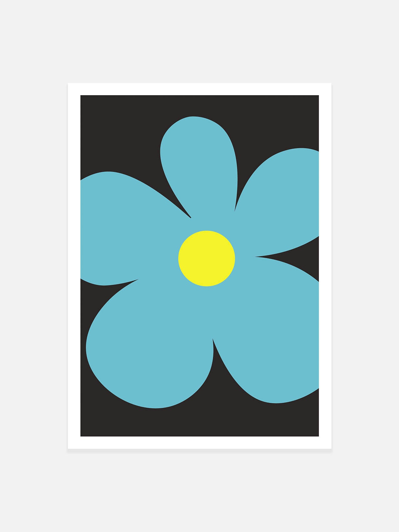
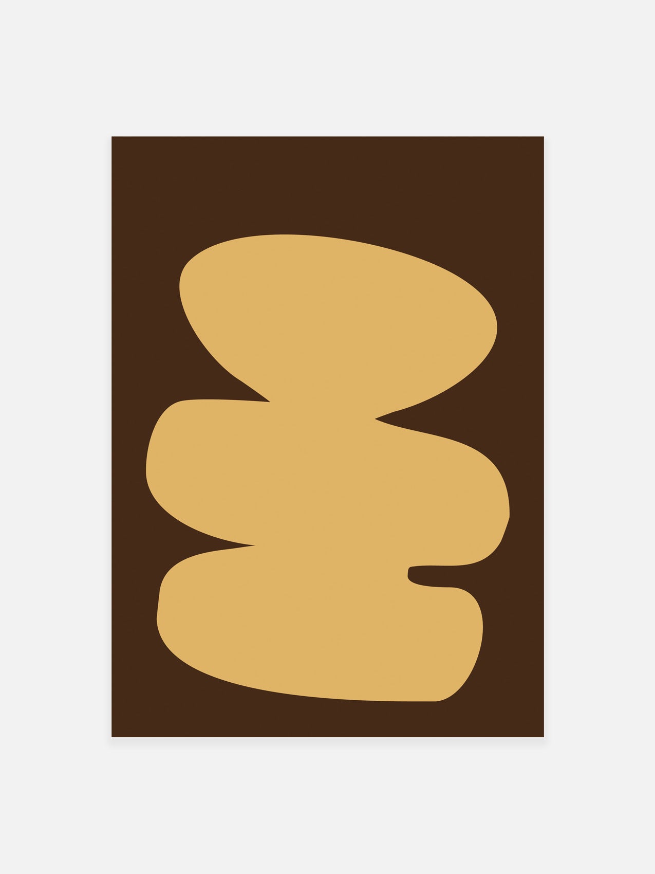
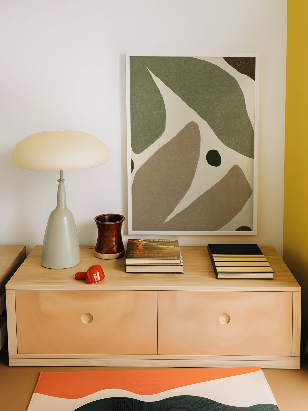
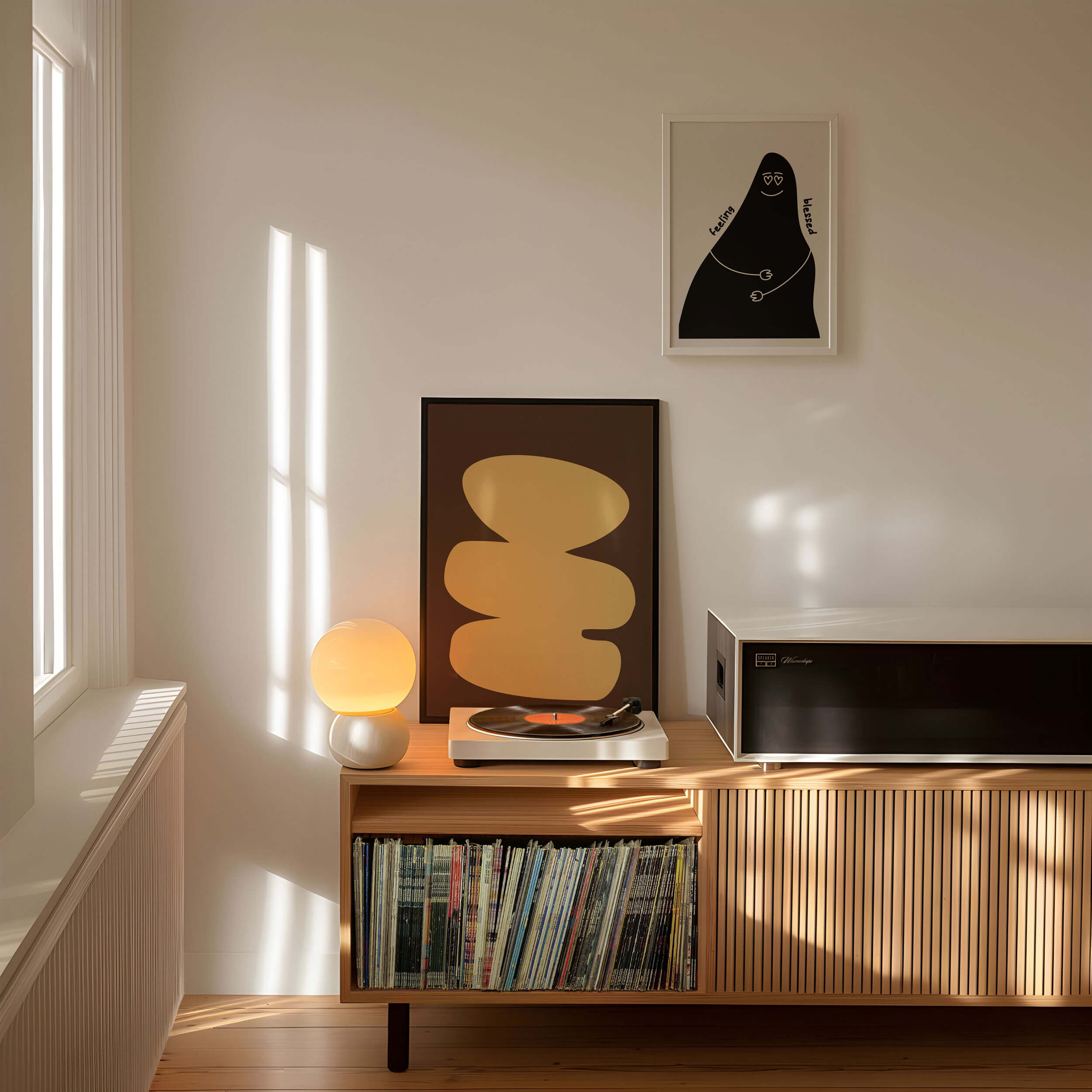
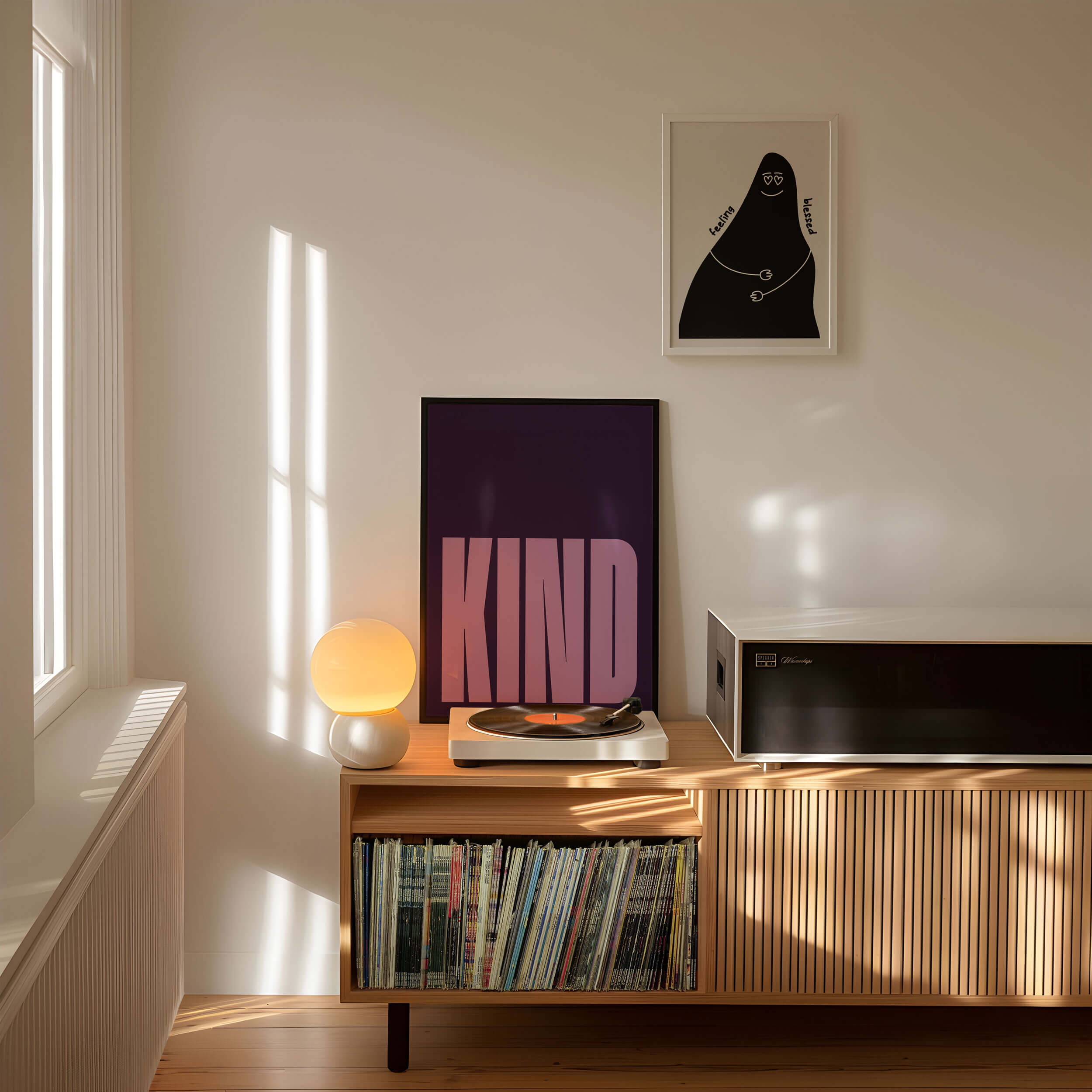
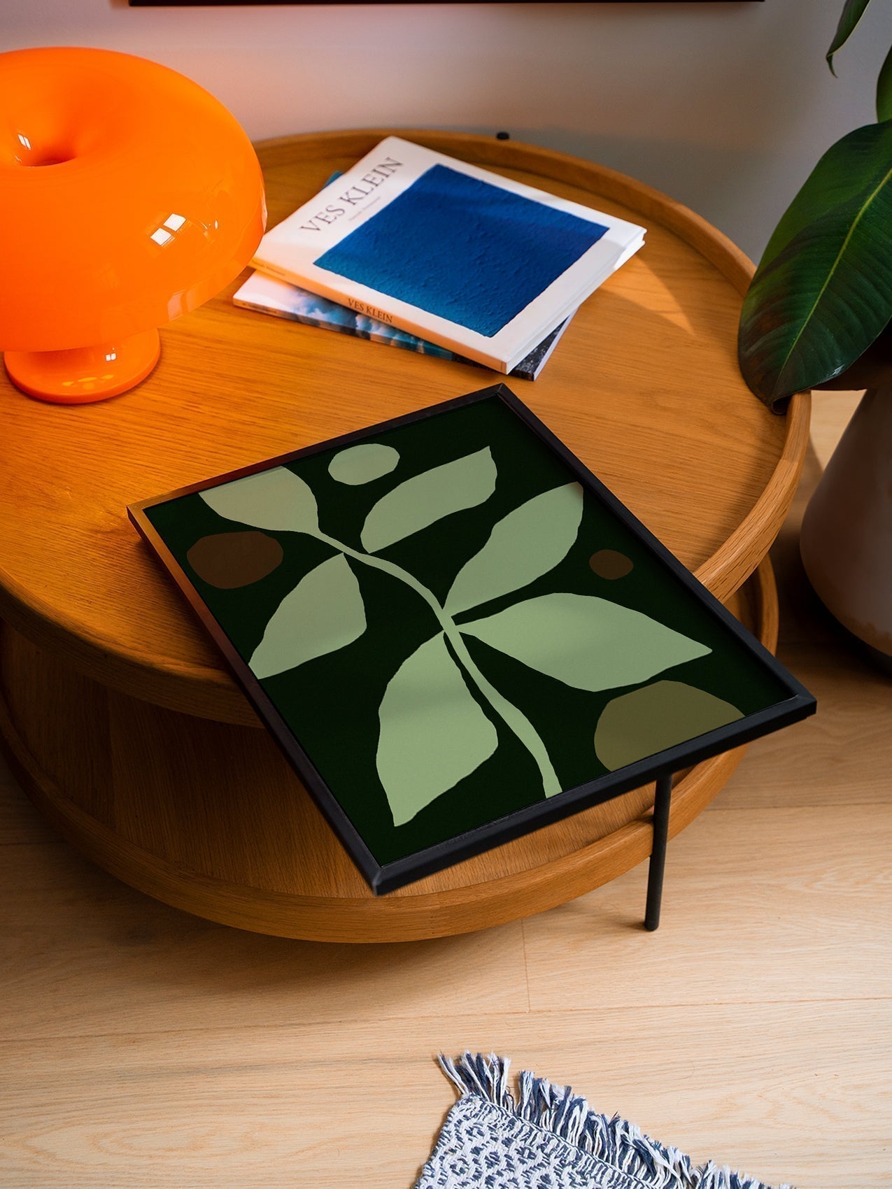
Noonstead’s nature-inspired giclée prints often feature greens, earthy tones, and muted pastels, perfect for calm, natural interiors.
Step 3: Match Wall Art to Furniture
-
For neutral furniture, use art as a statement color pop
-
For colored furniture, pick complementary tones
-
For patterned furniture, use simpler prints in matching tones
Step 4: Room-Specific Color Advice
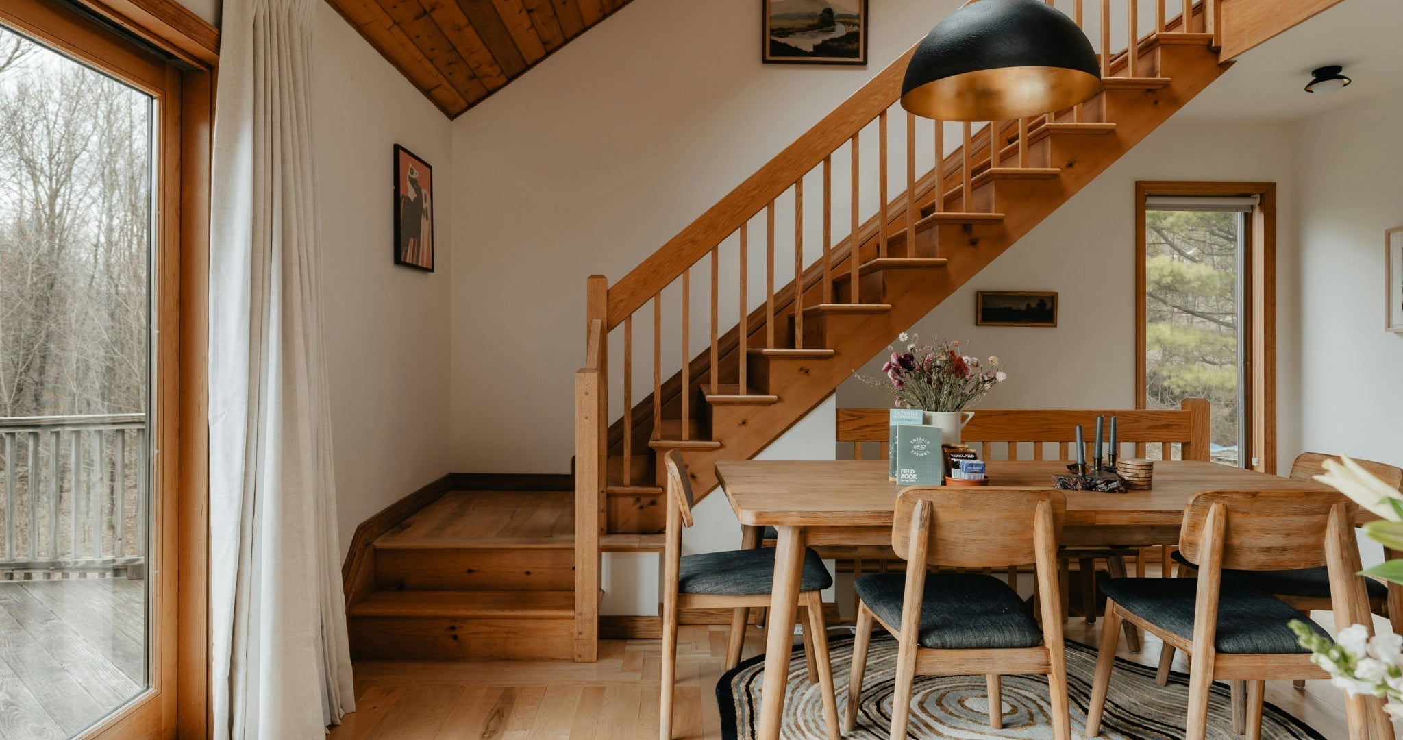
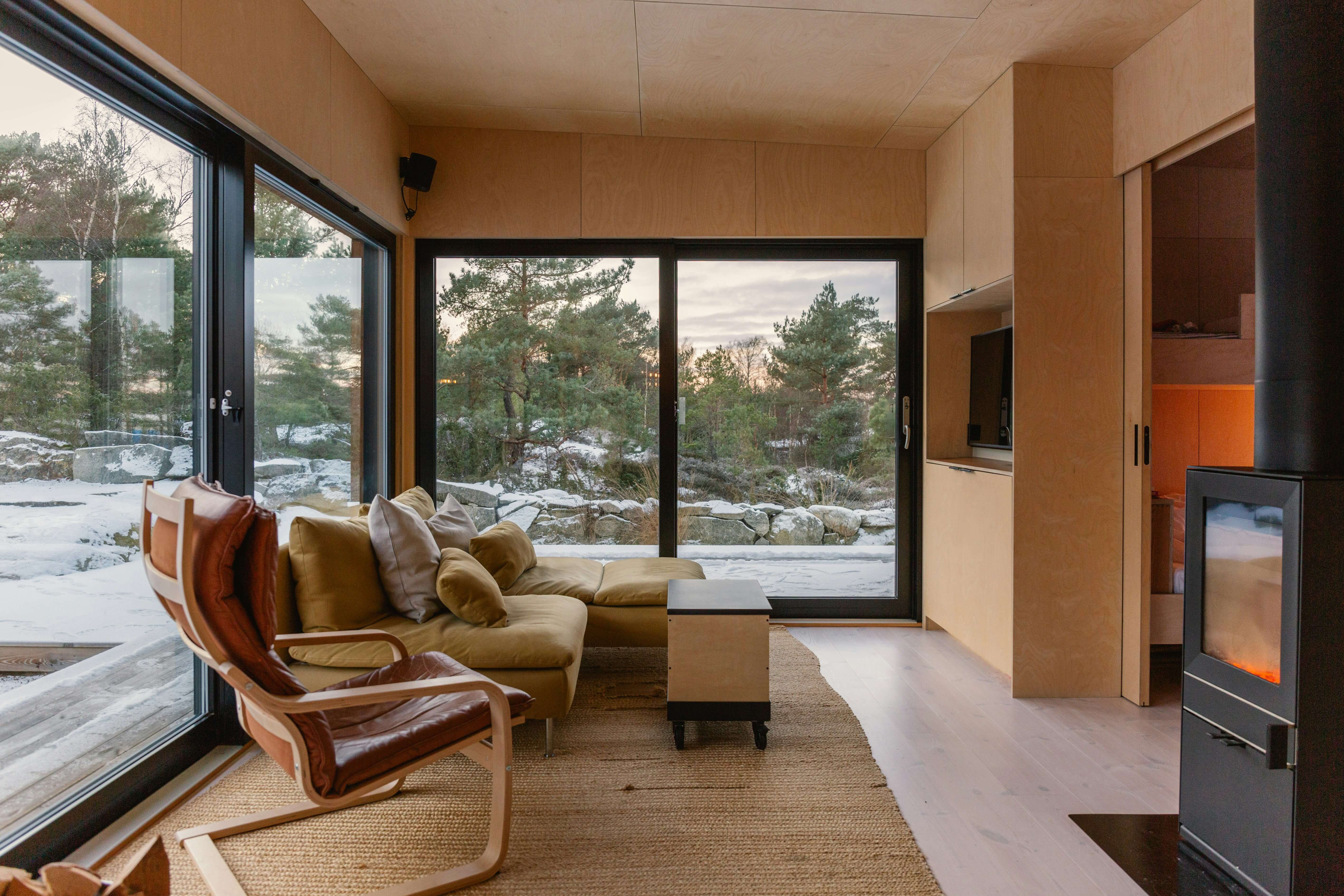
Living Room
-
Sofa and wall colors guide print choice
-
Accent cushions or rugs can tie prints into room palette
-
For sectional sofas → pick art that balances visual weight
Bedroom
-
Headboard + bedding color → artwork should harmonize
-
Cool tones → calm atmosphere
-
Warm tones → cozy, inviting vibe
Home Office
-
Neutral or muted tones → focus
-
Bright accents → energy and creativity
Step 5: Consider Lighting
-
Natural light: Colors appear brighter; adjust tones accordingly
-
Artificial light: Warm LEDs → colors shift; cool LEDs → colors crisp
-
North-facing rooms: may need warmer tones to feel cozy
-
South-facing rooms: may tolerate cooler tones
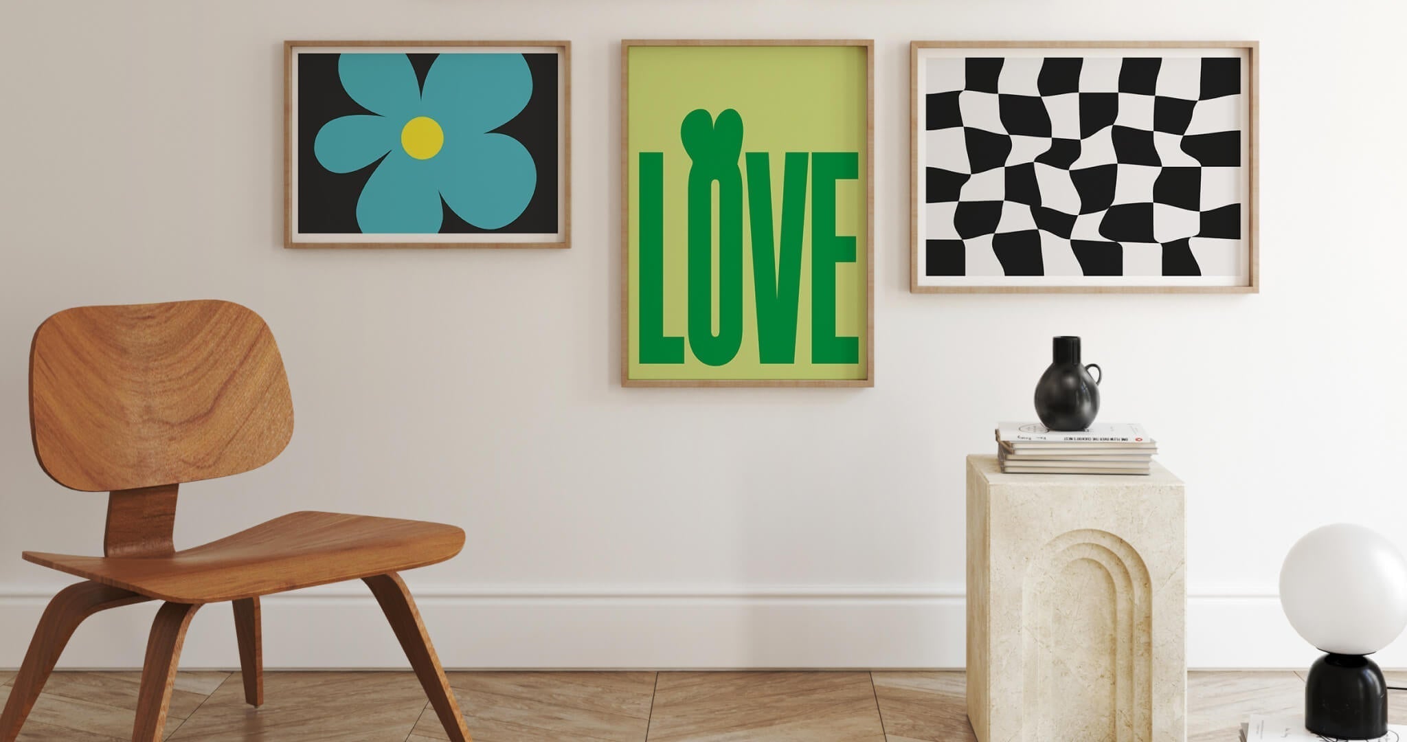
Step 6: Combine Patterns and Textures
-
Mix textured frames, metallics, or layered prints for interest
-
Keep color palette consistent across multiple prints
-
Triptychs or gallery walls → choose dominant color and repeat in smaller prints

Common Color Mistakes to Avoid
❌ Matching colors too literally → dull
❌ Ignoring room lighting → prints look different than intended
❌ Too many competing colors → visual chaos
❌ Choosing trendy colors without long-term appeal
Mini Case Study:
A client wanted bright yellow prints above a blue sofa. We added green accent print → cohesive, natural, calming palette.
Step-by-Step: Choosing the Perfect Wall Art Color
-
Assess walls, furniture, and flooring
-
Determine room mood / psychological effect
-
Pick dominant print color → complement or contrast with furniture
-
Use 60-30-10 rule for balance
-
Preview in room (swatches, prints, or digital mockup)
-
Adjust lighting and placement
FAQS
Q1: What color wall art goes best in living rooms?
-
Consider sofa, wall color, and lighting; use complementary or accent colors.
Q2: How do I pick colors for a gallery wall?
-
Choose a dominant tone and repeat in smaller prints for cohesion.
Q3: How does lighting affect print colors?
-
Natural light brightens; artificial light shifts tone; consider warm/cool balance.
Q4: Can I mix bold and neutral prints?
-
Yes, balance bold prints with neutral furniture or surrounding prints.
Q5: Should I follow trends or personal taste?
-
Focus on timeless palettes + natural inspiration; trend colors can be secondary accents.
Final Thoughts
The right colors transform your room. Consider walls, furniture, lighting, and mood for prints that feel intentional.
👉 Explore Noonstead’s nature-inspired giclée prints curated palettes that work perfectly in living rooms, bedrooms, offices, and gallery walls.
People also read

Canvas vs Framed Prints: Which Wall Art Is Best for Your Home?
Choosing between canvas prints and framed art prints can completely transform your home décor. This guide explains the differences and shows why Noonstead is one of the best places to buy art prints online.
Wall Art Trends 2026 You Must Try + Tips!
Discover the top wall art trends for 2026. Shop Noonstead modern prints for oversized statement walls, gallery walls, botanical designs and abstract art — stylish, affordable, and curated for every home.
Gallery Wall Layout Guide: Spacing, Arrangement & Designer Tips
Learn how to design the perfect gallery wall with expert spacing rules, layout ideas, and Noonstead-curated print sets for balanced, stylish, and stress-free home decorating.
Wall Art for Small Apartments: The Complete Guide
Discover how to choose wall art for small apartments. Learn the best print sizes, layouts, gallery wall ideas, and styling tips to make small spaces feel bigger and beautifully balanced.
The Best Place to Buy Art Prints Online in 2026 - Bookmark Ready!
Looking for the best place to buy art prints online? Noonstead offers curated, exclusive prints with premium quality. See top alternatives like Artsy, Etsy & Tate.

Top 25 Home Decor Brands in the UK to Bookmark in 2026
A curated list of the top 25 UK home décor brands for 2026, spanning independent makers and high-street favourites. Highlights include Noonstead’s bold art prints, Studio Arhoj’s ceramics, and brands like Habitat, M&S Home, and IKEA.
The Only 2026 Buyer’s Guide to High-Quality Art Prints You’ll Ever Need
Master 2026 art print buying: styles, materials, eco-friendly options, and expert tips to curate a timeless home gallery.
Art Prints That Improve Mood, Productivity & Wellbeing: Science + Design Guide
Discover how the right art prints can boost mood, productivity, and wellbeing. Science-backed tips to style your home for calm, focus, and energy.
Designer Multi-Room Wall Art Planning: Step-by-Step Guide to a Cohesive Home
Plan wall art for your entire home with our step-by-step guide. Create a cohesive, stylish, and personalised space with Noonstead’s modern prints.
Nature-Inspired Modern Art Prints: How to Bring Calm & Style to Every Room
Bring calm, style, and eco-conscious design to your home with Noonstead’s nature-inspired giclée prints. Discover art that tells a story.
How to Choose Wall Art: A Designer’s Step-by-Step Guide (No Guesswork)
Learn how to choose wall art with confidence. A designer-led step-by-step guide covering size, colour, placement, and style — no guesswork required.
How to Choose Wall Art Colours: Expert Tips for Every Room
Learn how to select the perfect wall art colours for every room. Designer-approved tips for matching art with furniture, wall colours, and room mood.