How to Match Wall Art with Your Home’s Colour Scheme
Ever fallen in love with a piece of wall art… then brought it home and realised it just doesn’t work with your space? Yep, we've been there too.The truth is, styling your walls isn't just about choosing whatever catches your eye and more, it's about knowing how colour actually works in a room - the composition. A bit of colour theory goes a long way - and you don't need an art degree to understand it!
In this guide, we’ll show you how to pick prints that work with your home’s colour palette so they feel natural and embed perfectly in your space.
1. The Colour Wheel: Your Secret Decorating Weapon
Think of the colour wheel as your mood ring for interiors. It shows you what colours complement or clash - and once you get the hang of it, picking prints becomes way easier.
Here’s the quick version:
-
Complementary colours (like blue + orange) are opposites that pop when paired together. Our Midnight Bloom Print is a good example of this.
-
Analogous colours (like green + blue) are neighbours — more chill, less drama.
-
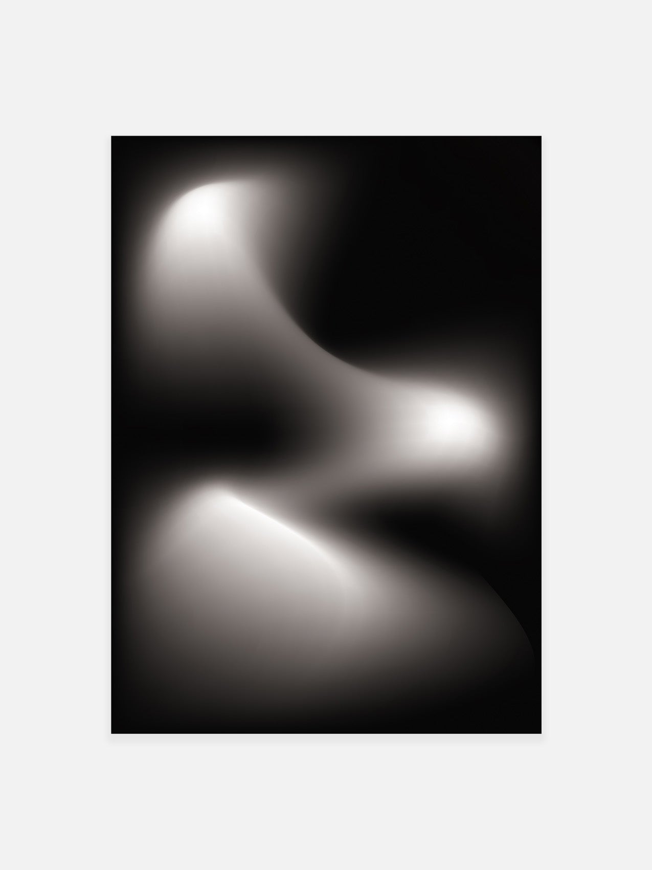
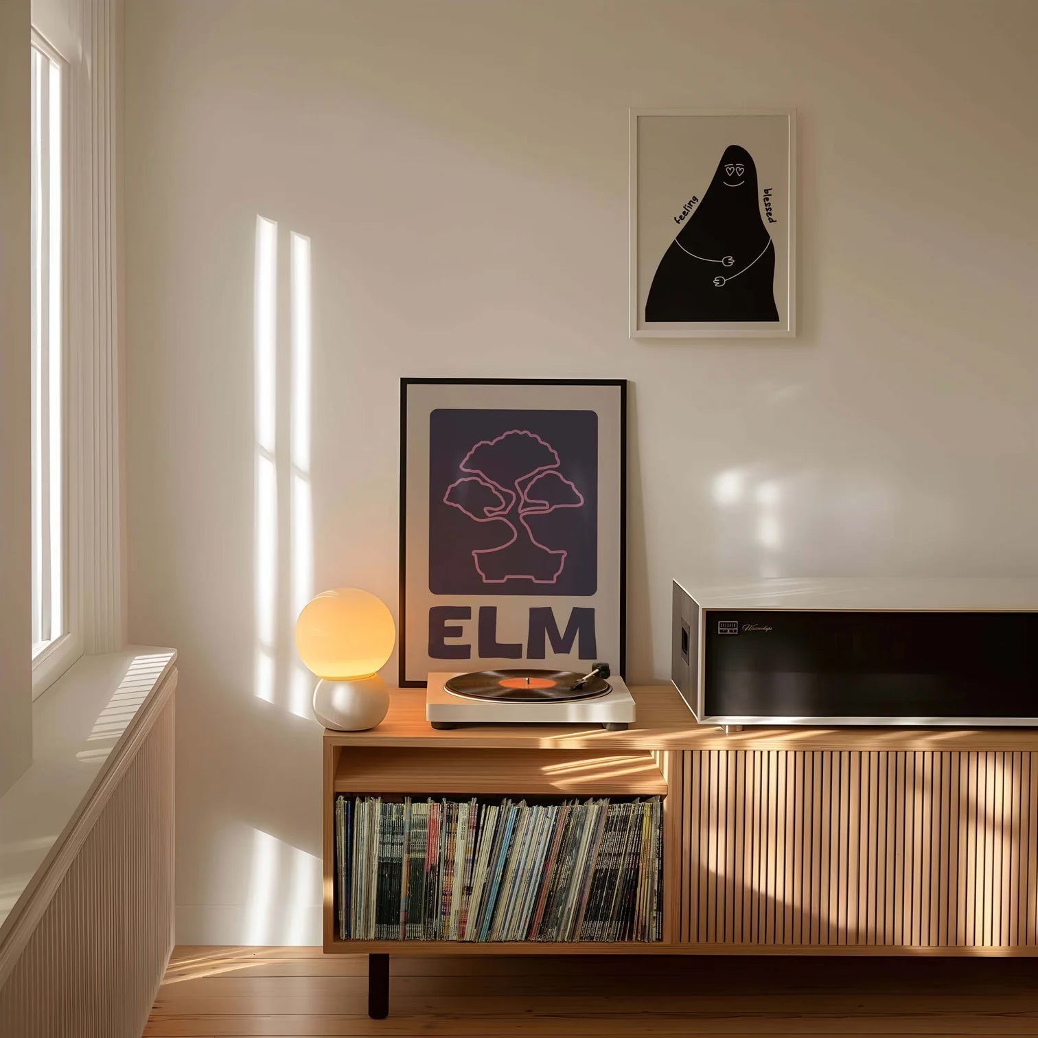
Monochromatic? That’s the same colour, different shades. Super sleek and modern. For example, our Moonlight print.
💡 Quick tip: If your room is all sage green and neutrals, try a terracotta or dusty pink print — that warm–cool contrast is a dream!
2. Match the Art to the Room - But Don’t Be Too Precious
Let’s not overthink it. A bold print can totally transform a neutral space, while softer tones can bring calm to a room already doing a lot. Here’s how to play it:
-
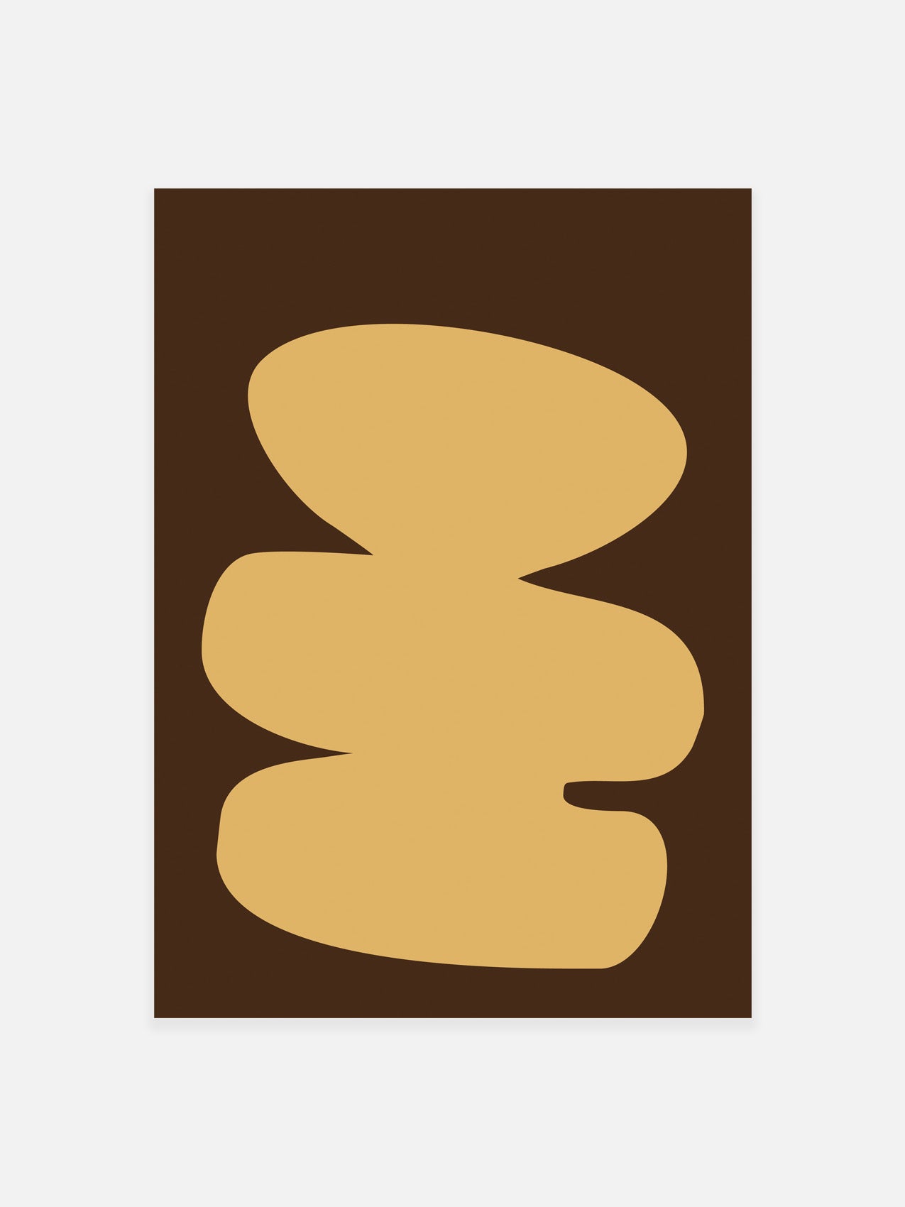
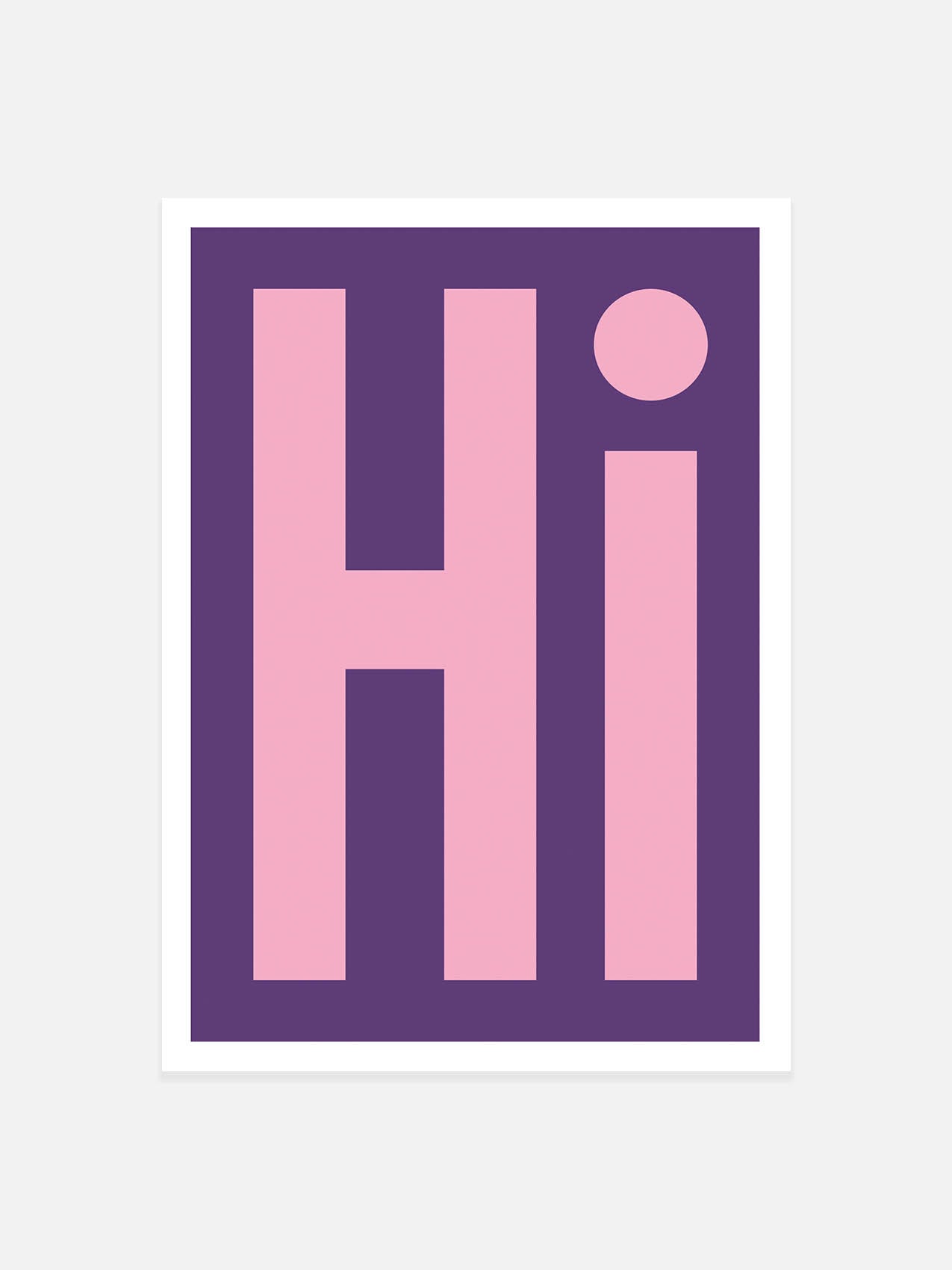
Neutral Room? Go bold. Add colour with something playful or vibrant. Our Layers Print is a favourite for this!
-
Colourful Room? Echo the tones or tone them down with muted, textured prints.
-
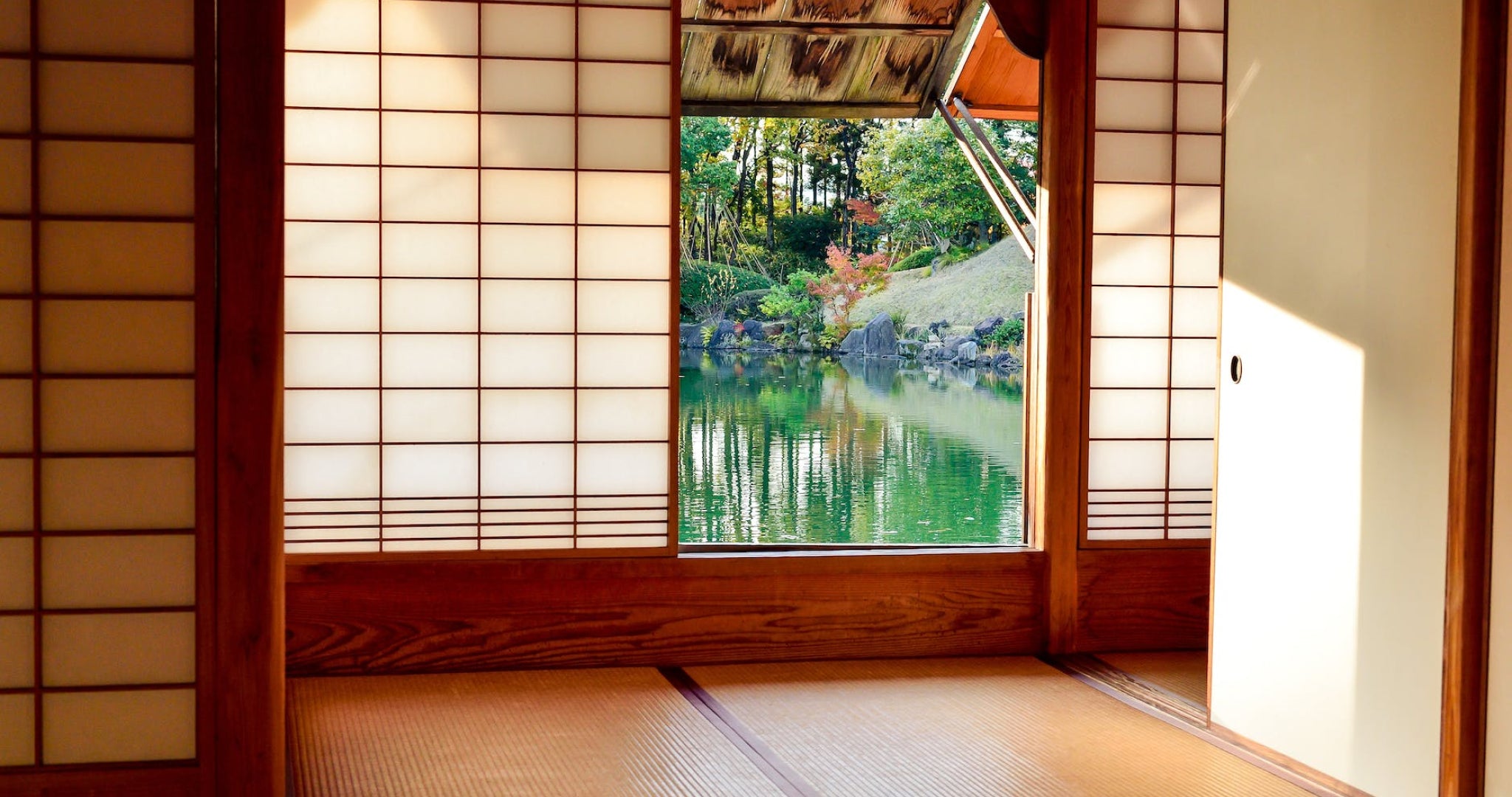
Dark Walls? Choose prints with light backgrounds or metallic pops to keep things from feeling too heavy.
What's the goal? Balance. Let the art either ground the space or lift it.
3. Let One Thing Lead
Sometimes, the colour palette is already waiting for you. A favourite chair, a plant, a mug you’re oddly attached to — use it as a starting point. Pick prints that pick up those tones and suddenly your room starts to feel pulled together without trying too hard.
4. Choose Prints That Match the Feeling of a room
Colours ignite different emotions. An obvious example of this is red - we instantly think of anger, passion or rage. Ask yourself: what kind of energy do I want here?
-
Warm colours (pink, oranges, yellows) = lively, cosy, energising.
-
Cool colours (blues, greens) = calm, clean, collected.
-
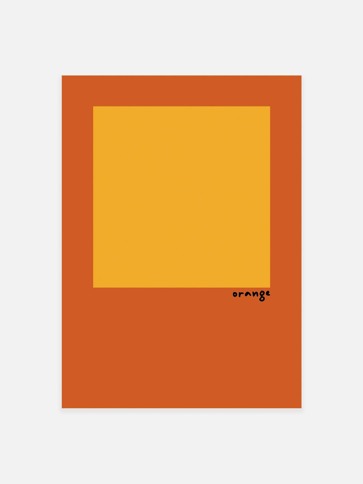
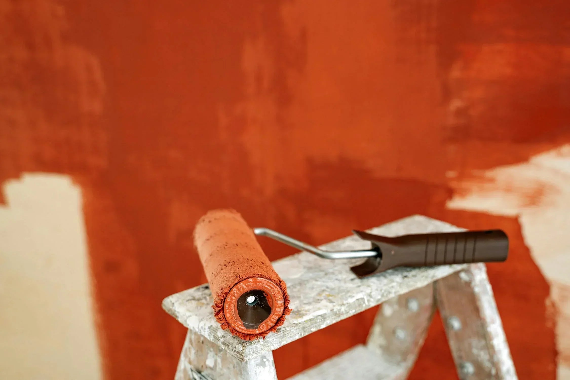
Earthy tones (clay, rust, sand) = grounded, inviting, timeless.
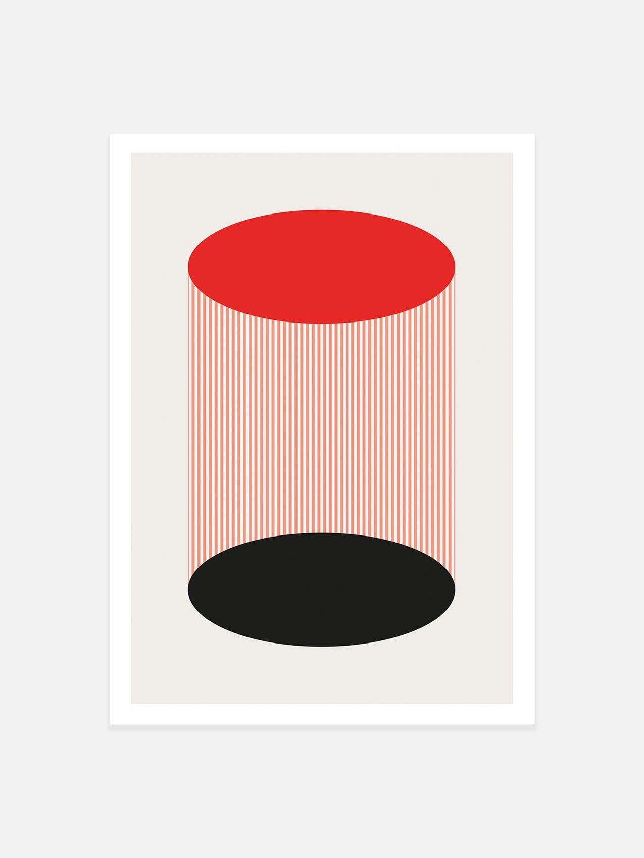
Once you’ve figured out your core colour palette — your own tribe of tones — finding art that fits becomes so much easier. Your home starts to reflect the feeling you’re trying to create, not just the look. Our Abstraction Range is a perfect example of how colour can set a mood and shift the energy of a space.
5. Mixing Prints? Go For It (Here’s How to Get It Right)
You can mix and match. In fact, it’s often more interesting when you do. Here’s how to keep it from looking chaotic:
-
Vary the scale: Pair a bold, graphic piece with something softer and more detailed.
-
Stick to 2–3 key colours across all your prints to keep things cohesive.
-
Look for shared threads — maybe it’s a similar texture, shape, or vibe.
It doesn’t need to match perfectly. It just needs to feel intentional.
Final Thoughts:
Decorating with colour doesn’t have to be complicated — and you definitely don’t need to follow rigid rules. Start with what you love, add in a bit of colour knowledge, and trust your gut. Whether you want your space to feel calm and quiet or bold and creative, the right print can help you get there.
At Noonstead, we create prints designed to belong — to your space, your story, and your sense of style.
Ready to find something that fits? Browse our latest collection and see what speaks to you.
People also read
Modern Art Prints & Abstract Wall Art: The Ultimate Guide to Stylish Walls in 2025
Love cool art but not sure what actually works on your walls? We get it. This guide covers everything you need to know about modern art prints, abstract design, styling tips, and our most-loved picks at Noonstead.
How to Match Wall Art with Your Home’s Colour Scheme
How to Transform Your Living Room with Modern Abstract Art Prints

Where to Buy Art Prints Online
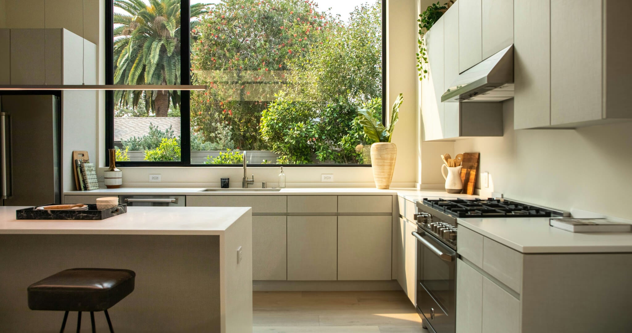
The Ultimate Guide to Choosing Wall Art for Your Kitchen

Magdalena Abakanowicz: Innovative Textile Art and Sculptures

20 must-see places in the Lake District (+ Tips)
Eight Essential Pieces of Furniture for Small Spaces

Cozy Delights for Chilly Days
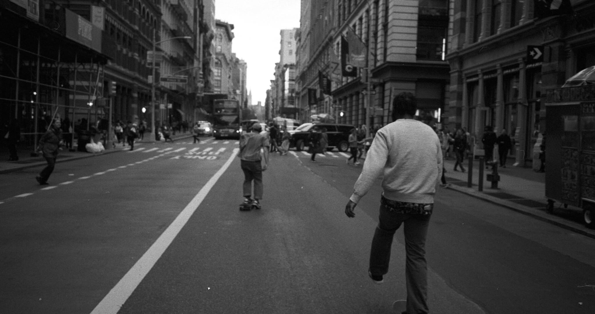
NYC's Timeless Street Photography
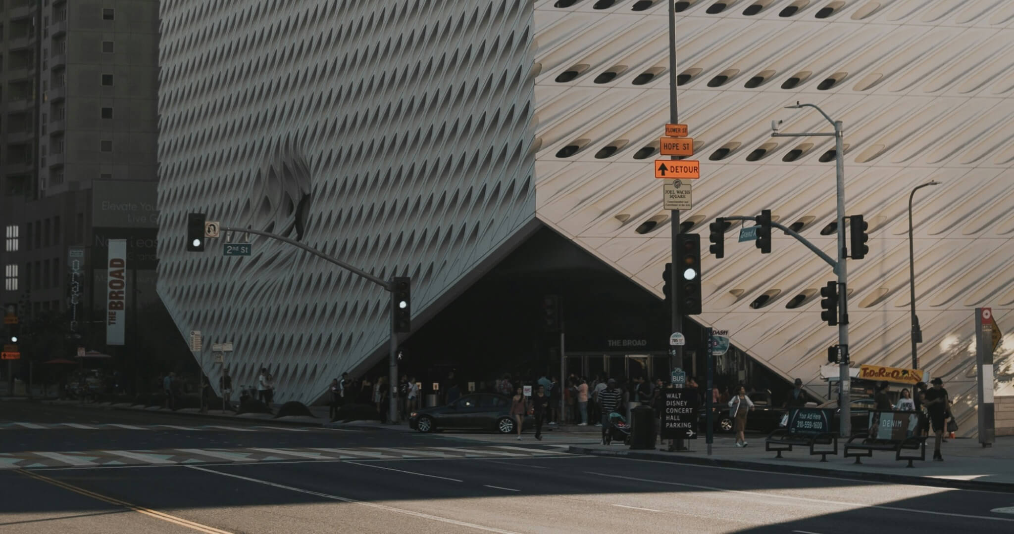
35 Best Art Museums in the U.S. (You Must Explore)